Nik Stanbridge
Analogue photography and printmaking
I persevered all I could with Clay Harmon’s methodology for establishing aquatint screen exposure time (or at least a ballpark time). In the end, I gave up because I decided I didn’t really know what he meant by exposing a Stouffer tablet until all the steps wash out to bare metal. I was up to a 30 minutes exposure time, and I still wasn’t getting all steps on the Stouffer wedge to wash out (or what I understood ‘washed out’ to mean). And, of course, being a newbie, I didn’t know whether I was in the right ballpark or not.
EDIT: I learned several weeks later that what Clay meant by “wash out to bare metal” was literally that… that the polymer film washed away leaving bare metal visible. As in, extreme ‘open bite’ that signifies not enough screen exposure. I learned this when I saw someone else’s test plate that exhibited this extreme open bite where bare plate material, metal, was visible.
I re-read the scant posts, articles and methodologies out there that were all relatively old. The (previously missed) nugget that jumped out at me was in the John Lybrook methodology. He stated that the longer the exposure time, the lighter will be the image (due to the plate being washed out). My photography brain probably had seen this in earlier readings, but how he explained how the image part of the screen/image exposure pairing impacts what happens as the plate is developed suddenly made sense.
I WAS INCREASING EXPOSURE TIMES WHEN I SHOULD HAVE BEEN DECREASING THEM!
At this point, I decided it would be a smart move to experiment with shorter, not longer, screen and image exposure times. I also decided to use John Lybrook’s integrated test image (with the circles) to establish both screen and image exposure times in one go (one plate).
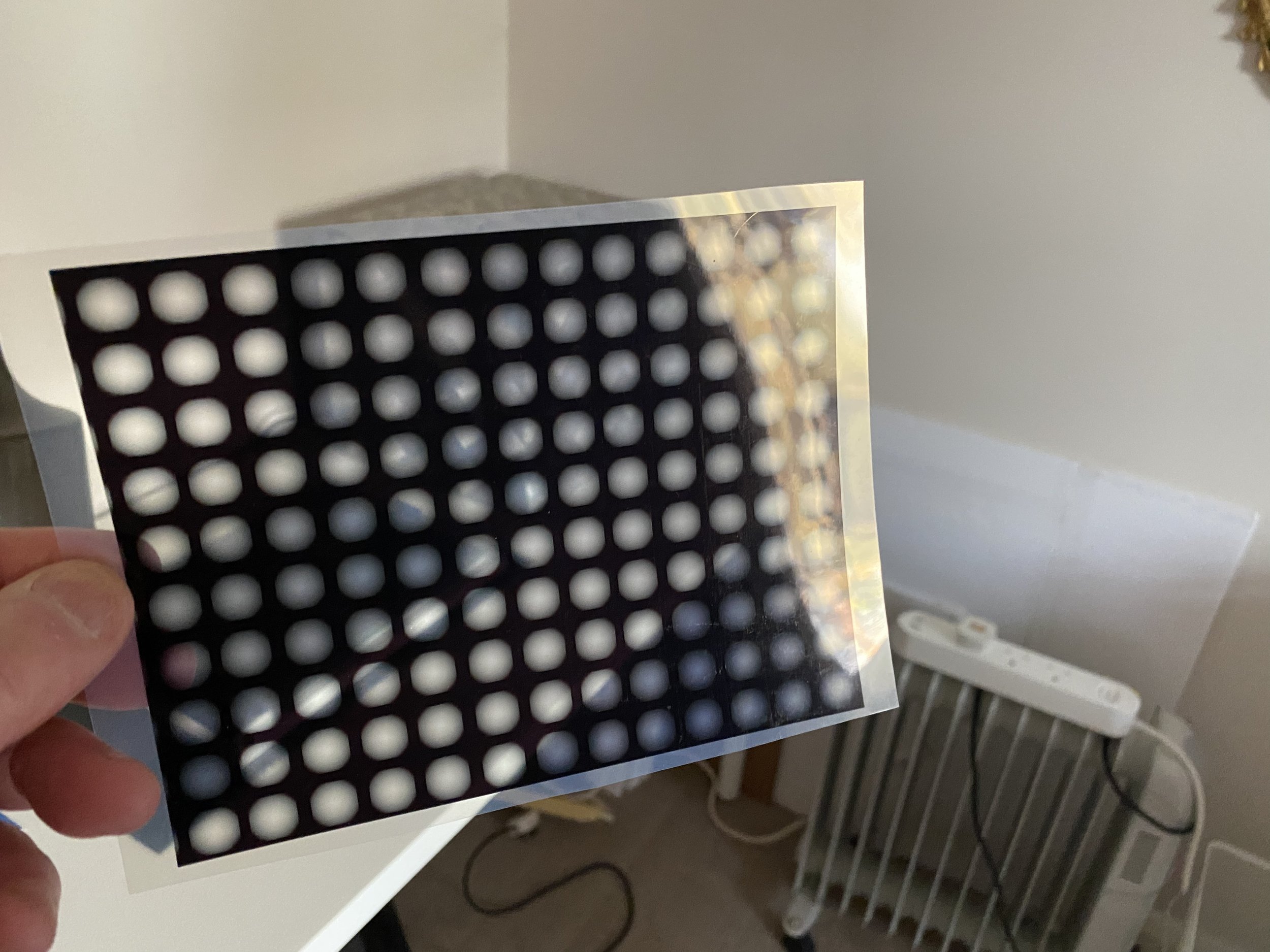
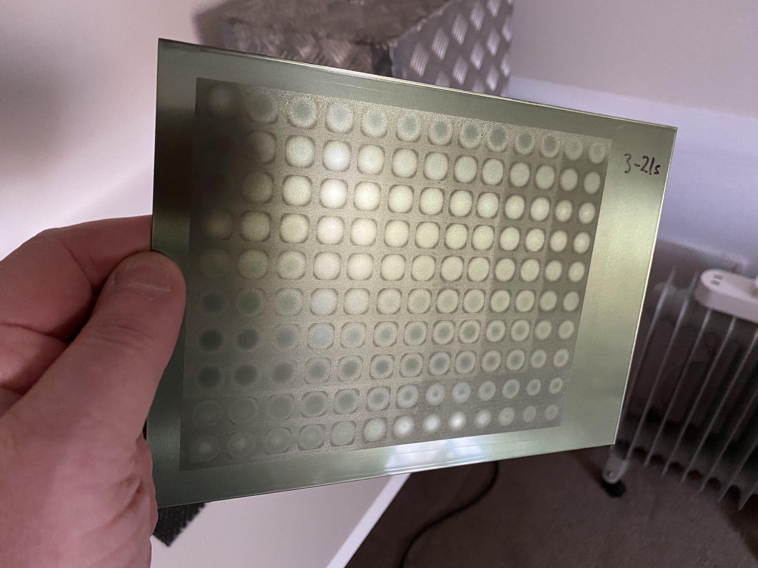
I exposed three plates to Jon’s test image. The first with three-second increments of screen and image exposure, another with 10-second increments and another with 30-second increments. I believed that this would give me coverage from three seconds to somewhere in the region of 10 minutes, covering the entire range that I had previously ignored.
The plates looked printable! So you can imagine how eager I was to get into the studio and get them inked and onto a press.
I printed the 30-second increment plate first and I could tell that my screen and image exposures would not come from this plate (but they were closer than I’d ever been). Then I printed the 10-second one, and then the one based on three second intervals. The three-second one produced the most promising print. I could see blacks and whites in the print so I knew I was close to deriving my screen and image exposure times.
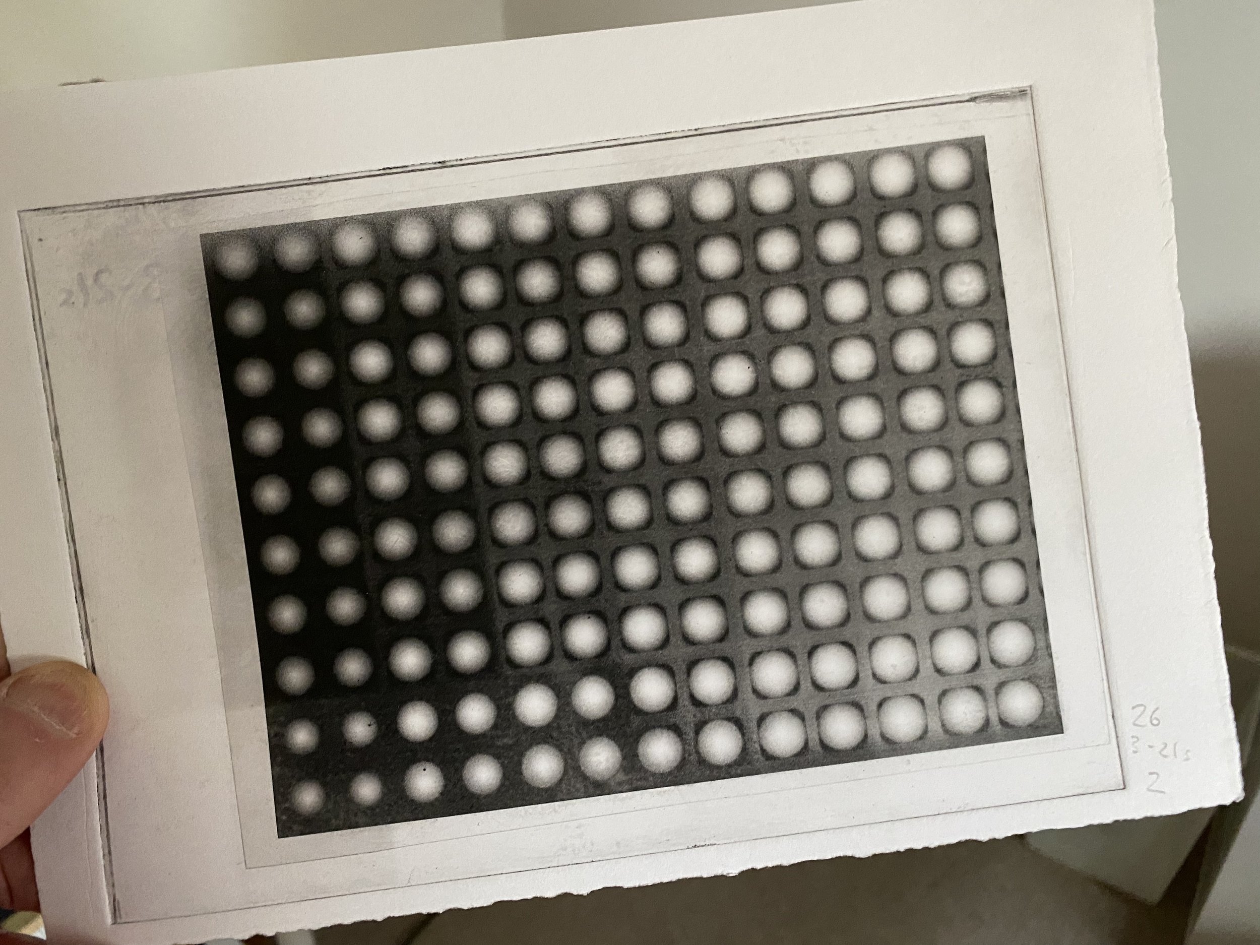
It did shock me though that it looked as though my optimum would be a ten-second screen exposure and something like a five second image exposure time. This didn’t really make sense given what I had read about other people and their calibration experiences, but hey, everybody’s light source is different! These numbers just looked ridiculously short.
The next step at this point in the calibration process is to use the experimentally determined exposure times to derive an image adjustmwnt curve that matches the capabilities of the photogravure printing process to the tonal scale of the source image. This is one of the fundamental and key elements of the whole calibration process.
There are a number of methodologies one can use to derive the adjustmnent curve. There’s one in Clay Harman’s book and Jon Lybrook has one. These are both quite manual and, I believe, superceded by automated methodologies such as the one provided (for free) by Easy Digital Negatives (EDN).
Despite the printed evidence, and for reasons I can’t remember or fathom in retrospect, I decided to produce an EDN calibration step tablet plate using 10 seconds for both image and screen exposure, rather than use five for the image. The test plate looked eminently printable though. Phew!
I produced three prints of the EDN calibration image plate using carbon black ink and was delighted with the results because I could see pure whites and blacks. As per the EDN process requirements, I took photographs of the prints; resized, scaled and inverted the images and put them into the EDN website tool and lo and behold a quite good looking adjustment curve emerged. As in, it had the shape I was expecting.
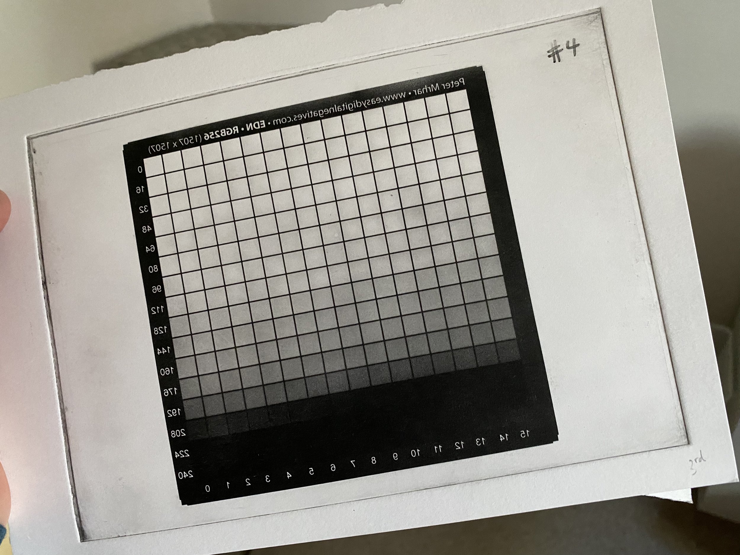
EDIT: The fact that the EDN test image looked OK and the resulting curve had the right shape actually meant nothing. They were tests with test images. I put far too much faith in them (mostly because of my months of failures and how desperate I was for success!).
You can imagine how excited I was though. I now had the critical component of my workflow: The process adjustment curve for MY workflow (acetate process, UV unit, paper, ink etc.).
At this point I obviously ignored the advice to apply my derived adjustment curve to the EDN test tablet image and compare this to a print of the modified tablet to check that they were the same: critical for fine tuning!
Instead I decided to create plates of real images and get cracking on with my printmaking journey. I also decided to go the whole hog and produce some expensive A5 plates having done all my testing on A6 to keep the costs down. All this based on my supreme confidence in the EDN process and my good looking adjustment curve.
Foolish. The prints were rubbish. Pale and very contrasty because the image exposure times were too long (I now know). Remember, I’d used 10s for the image exposure when it probably should have been five.
